Pro2col
Designing clarity into a wellness platform built for long-term behavior change
Pro2col
Designing clarity into a wellness platform built for long-term behavior change
Industry
Health & Wellness
Client
Herbalife
Scope
UI/UX Design
Company
Strategy CX
THE CHALLENGE
Making a dense app feel light enough to return to
THE CHALLENGE
Making a dense app feel light enough to return to
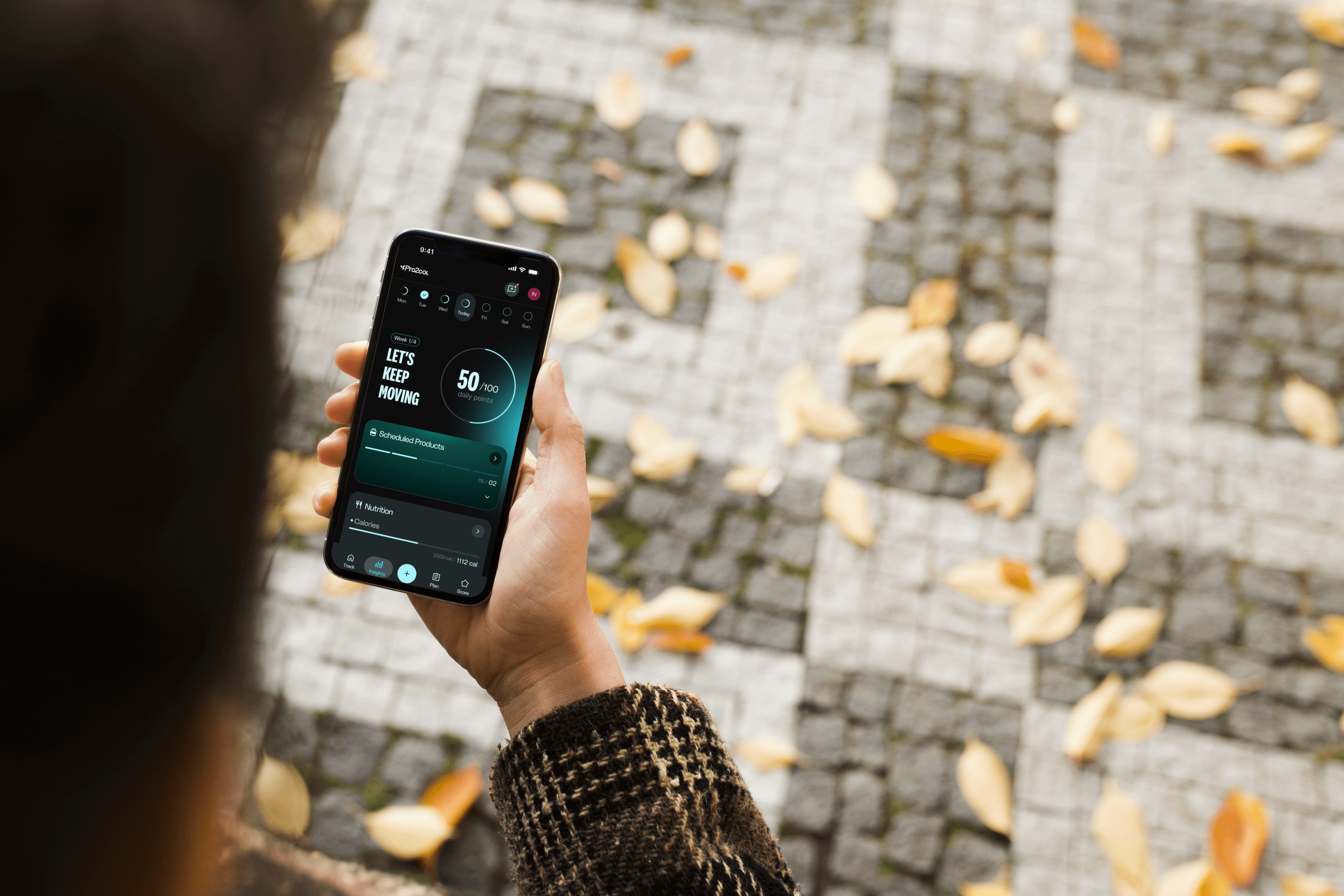
Wellness apps share a brutal failure mode: most are opened once and never again. Across the category, the majority of health & fitness apps lose the overwhelming share of their users within the first weeks — long before any habit forms or any personalization can prove its worth.
So the design problem was never "show more." It was: how do we make a dense, data-heavy app feel clear enough that someone opens it on day 14 — not just day 1? That question framed the work on the surfaces I owned.
Wellness apps share a brutal failure mode: most are opened once and never again. Across the category, the majority of health & fitness apps lose the overwhelming share of their users within the first weeks — long before any habit forms or any personalization can prove its worth.
So the design problem was never “show more.” It was: how do we make a dense, data-heavy app feel clear enough that someone opens it on day 14 — not just day 1? That question framed the work on the surfaces I owned.
WHO WE DESIGNED FOR
Two users pulling in opposite directions
WHO WE DESIGNED FOR
Two users pulling in opposite directions
with team
We developed behavioral personas to ground the design in real tension, not assumptions. Two of them shaped the surfaces I worked on most — and the conflict between them became the central design problem.
Forecasting was slow and error-prone due to siloed systems, lack of automation, and inconsistent data. Teams worked in isolation, manually updating Excel files, and constantly reconciling disconnected inputs. These inefficiencies didn’t just affect planning—they impacted operational reliability.
To ground our design strategy, we launched a comprehensive discovery phase: four weeks of field research, 62 interviews across 56 people, totaling over 45 hours of conversations. These sessions revealed widespread friction, from duplicated processes to missing version control and constant miscommunication between departments.

The Skeptic
WANTS → CLARITY
New to wellness apps, time-poor, allergic to clutter. Skims onboarding, abandons anything that feels long or rigid, responds to small early wins. If the first screen feels heavy, this user is gone.
Forecasting was slow and error-prone due to siloed systems, lack of automation, and inconsistent data. Teams worked in isolation, manually updating Excel files, and constantly reconciling disconnected inputs. These inefficiencies didn’t just affect planning—they impacted operational reliability.
To ground our design strategy, we launched a comprehensive discovery phase: four weeks of field research, 62 interviews across 56 people, totaling over 45 hours of conversations. These sessions revealed widespread friction, from duplicated processes to missing version control and constant miscommunication between departments.

The Optimizer
WANTS → DEPTH
Experienced and data-fluent. Wants detailed insights, weekly analytics, data that evolves with them. Easily frustrated by an app that feels shallow or treats them like a beginner.
Forecasting was slow and error-prone due to siloed systems, lack of automation, and inconsistent data. Teams worked in isolation, manually updating Excel files, and constantly reconciling disconnected inputs. These inefficiencies didn’t just affect planning—they impacted operational reliability.
To ground our design strategy, we launched a comprehensive discovery phase: four weeks of field research, 62 interviews across 56 people, totaling over 45 hours of conversations. These sessions revealed widespread friction, from duplicated processes to missing version control and constant miscommunication between departments.
Clarity vs. depth. The Skeptic is why the dashboard had to strip down to essentials; the Optimizer is why Insights had to reward a deeper look. Designing for both drove the decisions across the app.
Forecasting was slow and error-prone due to siloed systems, lack of automation, and inconsistent data. Teams worked in isolation, manually updating Excel files, and constantly reconciling disconnected inputs. These inefficiencies didn’t just affect planning—they impacted operational reliability.
To ground our design strategy, we launched a comprehensive discovery phase: four weeks of field research, 62 interviews across 56 people, totaling over 45 hours of conversations. These sessions revealed widespread friction, from duplicated processes to missing version control and constant miscommunication between departments.
FIRST ACCESS & ASSESSMENT
Onboarding as a foundation, not a form
FIRST ACCESS & ASSESSMENT
Onboarding as a foundation, not a form
with team
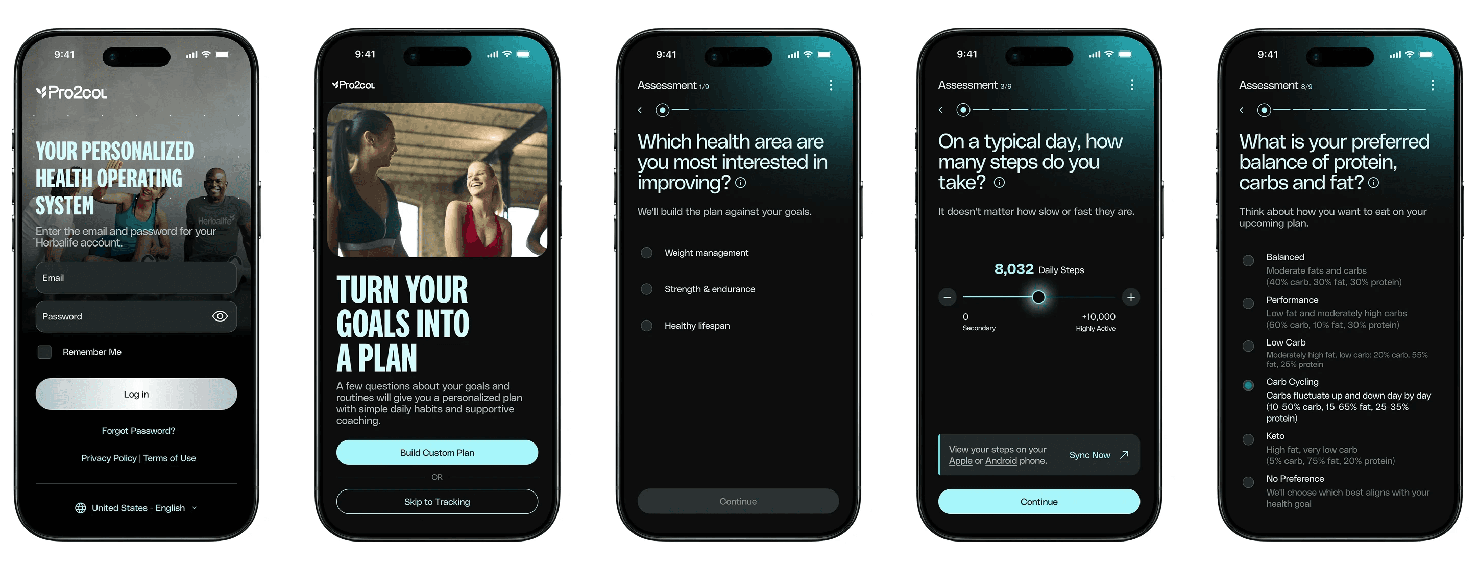
The onboarding experience became the foundation for the entire ecosystem. Because personalization depended heavily on behavioral and wellness information, the assessment flow needed to collect meaningful data without feeling overwhelming or excessively clinical.
Rather than approaching onboarding as a static questionnaire, the experience was designed to feel lighter, more progressive, and easier to navigate — helping users transition naturally into their personalized wellness journey.
Forecasting was slow and error-prone due to siloed systems, lack of automation, and inconsistent data. Teams worked in isolation, manually updating Excel files, and constantly reconciling disconnected inputs. These inefficiencies didn’t just affect planning—they impacted operational reliability.
To ground our design strategy, we launched a comprehensive discovery phase: four weeks of field research, 62 interviews across 56 people, totaling over 45 hours of conversations. These sessions revealed widespread friction, from duplicated processes to missing version control and constant miscommunication between departments.
Simplify to standardize
Simplify to standardize
with team
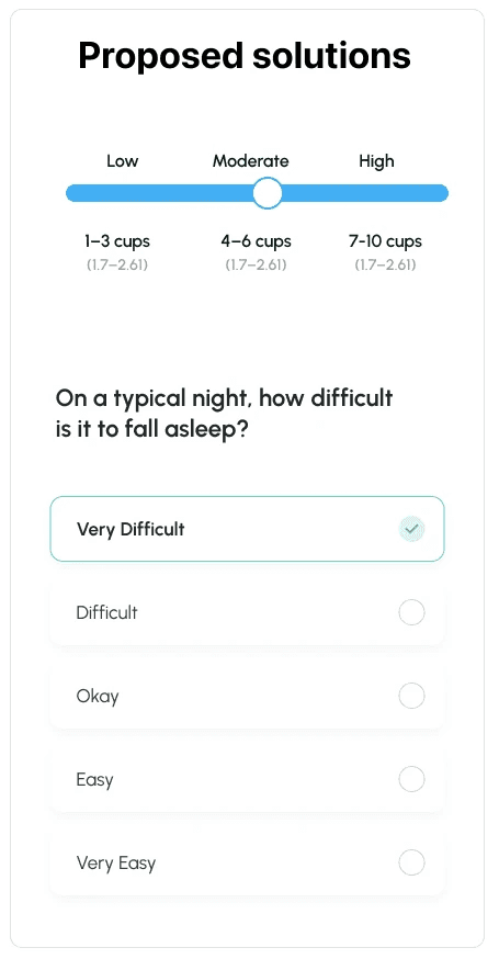
I also worked — with the team — on how the assessment captures input. The original questions leaned on complex sliders that created hesitation: when users can't answer confidently, they guess, and guesses produce unreliable plans.
Forecasting was slow and error-prone due to siloed systems, lack of automation, and inconsistent data. Teams worked in isolation, manually updating Excel files, and constantly reconciling disconnected inputs. These inefficiencies didn’t just affect planning—they impacted operational reliability.
To ground our design strategy, we launched a comprehensive discovery phase: four weeks of field research, 62 interviews across 56 people, totaling over 45 hours of conversations. These sessions revealed widespread friction, from duplicated processes to missing version control and constant miscommunication between departments.


CURRENT STATE
The rainbow slider competes with the stepper (+/−) for the same action — redundant signals for a choice that's already discrete. The color spectrum adds cognitive load, not clarity, and points sit too close to the buttons, making mis-taps easy.
Forecasting was slow and error-prone due to siloed systems, lack of automation, and inconsistent data. Teams worked in isolation, manually updating Excel files, and constantly reconciling disconnected inputs. These inefficiencies didn’t just affect planning—they impacted operational reliability.
To ground our design strategy, we launched a comprehensive discovery phase: four weeks of field research, 62 interviews across 56 people, totaling over 45 hours of conversations. These sessions revealed widespread friction, from duplicated processes to missing version control and constant miscommunication between departments.
The rainbow slider competes with the stepper (+/−) for the same action — redundant signals for a choice that's already discrete. The color spectrum adds cognitive load, not clarity, and points sit too close to the buttons, making mis-taps easy.
CURRENT STATE
Many questions reuse the same slider pattern while changing what the scale means — intensity vs. frequency vs. duration. Users re-interpret the scale on every screen, adding load during sensitive, self-reported questions (sleep, anxiety).
Forecasting was slow and error-prone due to siloed systems, lack of automation, and inconsistent data. Teams worked in isolation, manually updating Excel files, and constantly reconciling disconnected inputs. These inefficiencies didn’t just affect planning—they impacted operational reliability.
To ground our design strategy, we launched a comprehensive discovery phase: four weeks of field research, 62 interviews across 56 people, totaling over 45 hours of conversations. These sessions revealed widespread friction, from duplicated processes to missing version control and constant miscommunication between departments.
Many questions reuse the same slider pattern while changing what the scale means — intensity vs. frequency vs. duration. Users re-interpret the scale on every screen, adding load during sensitive, self-reported questions (sleep, anxiety).
SOLUTION
Standardize subjective measures with multiple-choice inputs and consistent anchors (None / Sometimes / Often, or Low / Moderate / High). Less cognitive load, no redundant sliders, clearer and more reliable responses — data integrity intact, and the assessment feels supportive, not taxing.
Forecasting was slow and error-prone due to siloed systems, lack of automation, and inconsistent data. Teams worked in isolation, manually updating Excel files, and constantly reconciling disconnected inputs. These inefficiencies didn’t just affect planning—they impacted operational reliability.
To ground our design strategy, we launched a comprehensive discovery phase: four weeks of field research, 62 interviews across 56 people, totaling over 45 hours of conversations. These sessions revealed widespread friction, from duplicated processes to missing version control and constant miscommunication between departments.
Standardize subjective measures with multiple-choice inputs and consistent anchors (None / Sometimes / Often, or Low / Moderate / High). Less cognitive load, no redundant sliders, clearer and more reliable responses — data integrity intact, and the assessment feels supportive, not taxing.
WELLNESS DASHBOARD & TRACKING
A dashboard that answers four questions, fast
WELLNESS DASHBOARD & TRACKING
A dashboard that answers four questions, fast
CORE · MY WORK
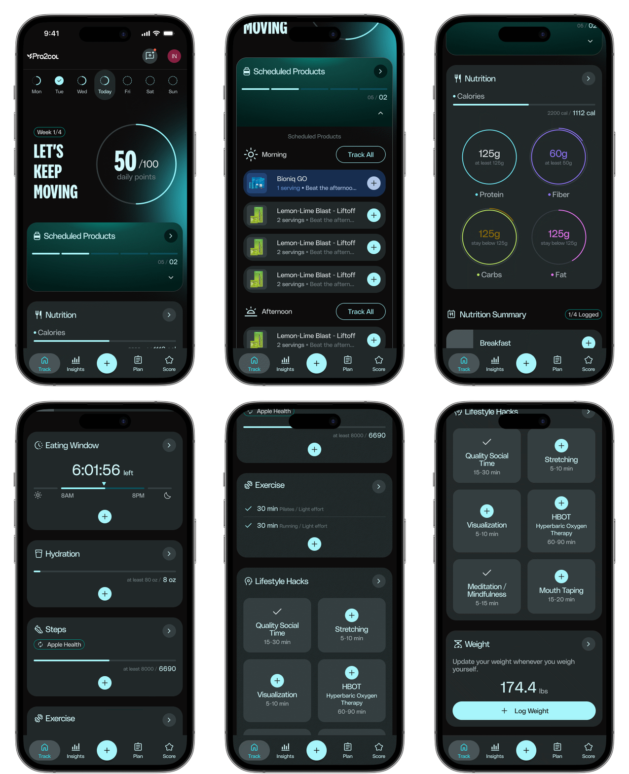
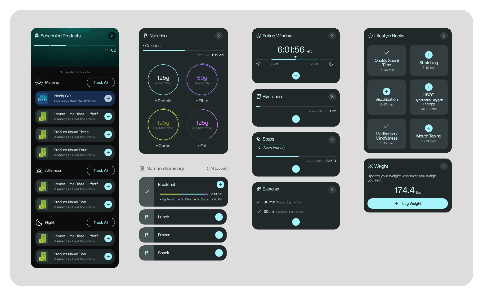
Once onboarded, users land in a daily workflow where tracking, coaching, reminders, and progress all compete for attention — the single biggest source of cognitive overload in a wellness app, and a direct threat to retention.
I designed the dashboard around four questions a user should answer in seconds: where they are, what needs attention, how they're progressing, and what matters most right now. That hierarchy became my rule for what earned a place on the primary screen — a direct answer to the Skeptic, who leaves the moment a screen feels heavy.
Forecasting was slow and error-prone due to siloed systems, lack of automation, and inconsistent data. Teams worked in isolation, manually updating Excel files, and constantly reconciling disconnected inputs. These inefficiencies didn’t just affect planning—they impacted operational reliability.
To ground our design strategy, we launched a comprehensive discovery phase: four weeks of field research, 62 interviews across 56 people, totaling over 45 hours of conversations. These sessions revealed widespread friction, from duplicated processes to missing version control and constant miscommunication between departments.
TRENDS & INSIGHTS
Progress that motivates, not just informs
TRENDS & INSIGHTS
Progress that motivates, not just informs
CORE · MY WORK
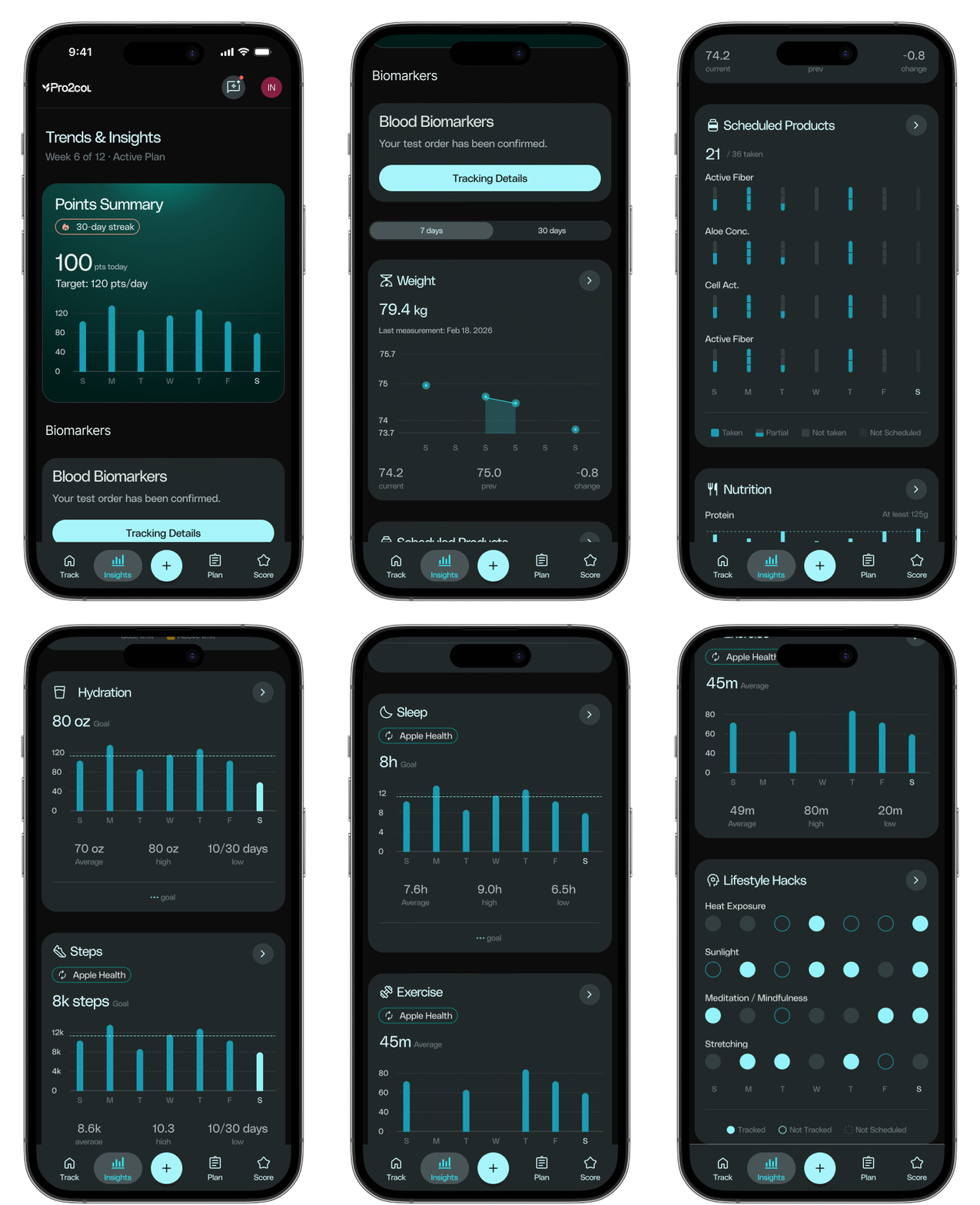
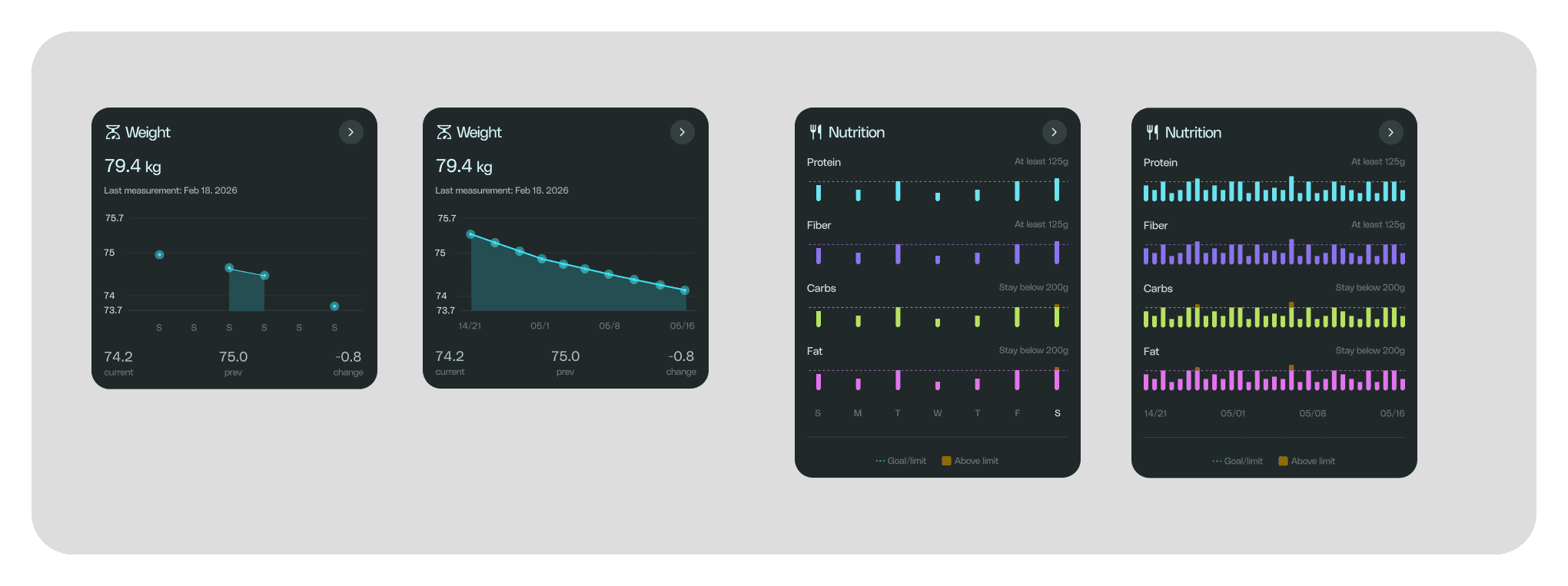
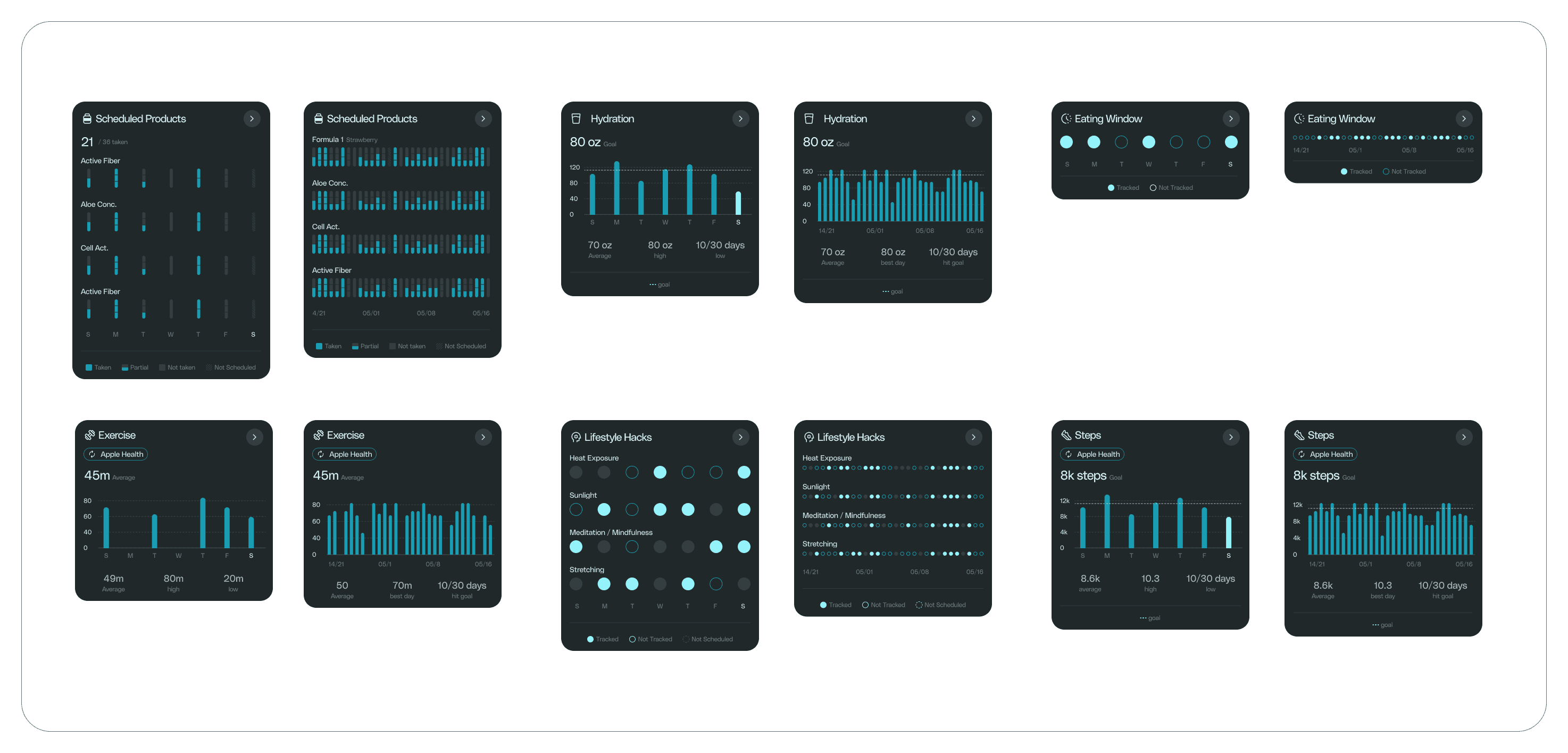
Behavior change is hard to sustain when progress is invisible. Raw charts inform — they rarely motivate, and a wall of metrics is just another way to overwhelm someone.
I worked on the Insights experience to make progress feel visible: surfacing meaningful change through contextual summaries and clear indicators, prioritizing momentum over exhaustive data. This is also where the Optimizer is met — depth is there for those who want it, without burdening those who don't.
Forecasting was slow and error-prone due to siloed systems, lack of automation, and inconsistent data. Teams worked in isolation, manually updating Excel files, and constantly reconciling disconnected inputs. These inefficiencies didn’t just affect planning—they impacted operational reliability.
To ground our design strategy, we launched a comprehensive discovery phase: four weeks of field research, 62 interviews across 56 people, totaling over 45 hours of conversations. These sessions revealed widespread friction, from duplicated processes to missing version control and constant miscommunication between departments.
PERSONALIZED PLANS
Data turned into a narrative
PERSONALIZED PLANS
Data turned into a narrative
CONTEXT
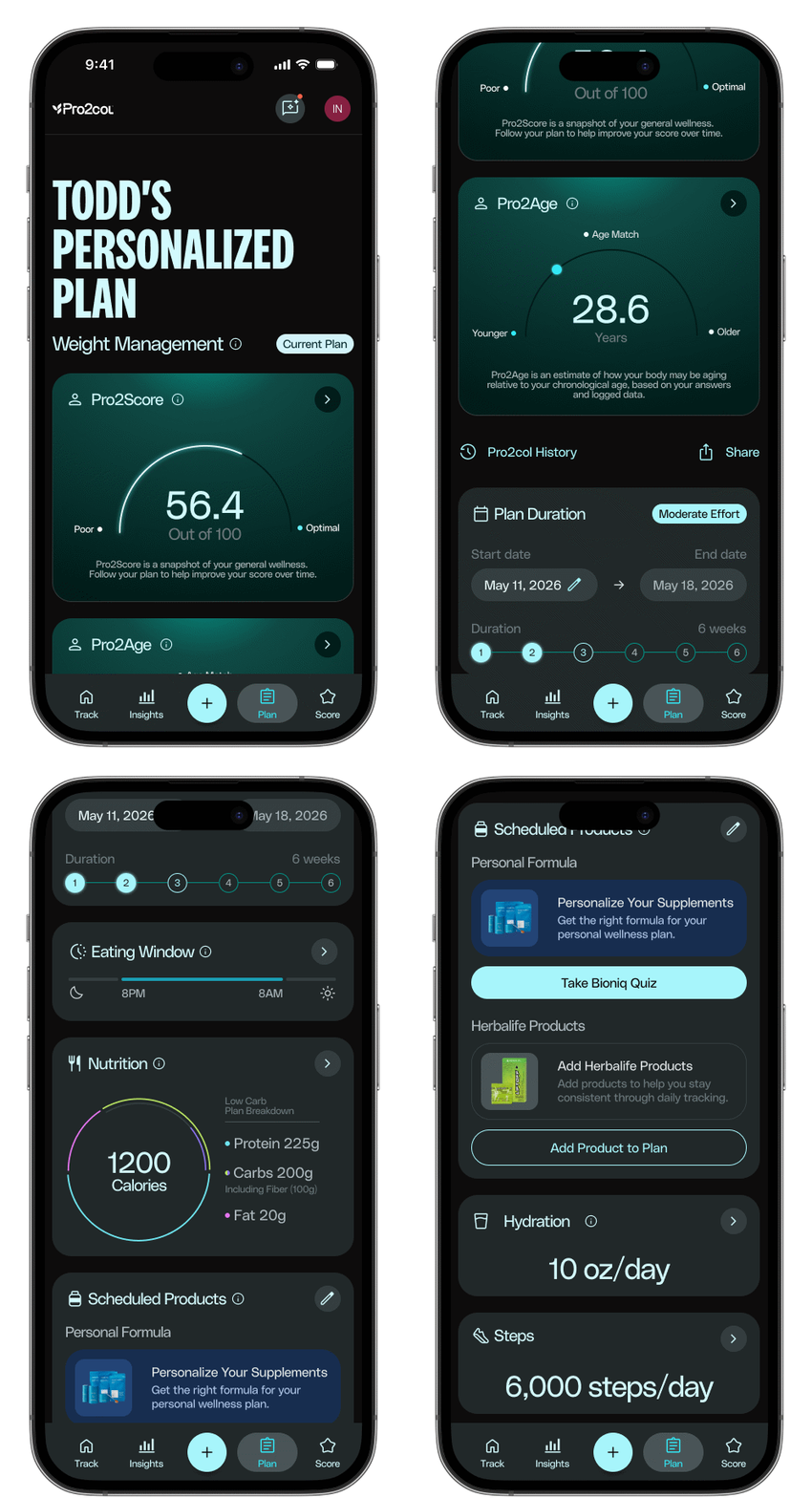
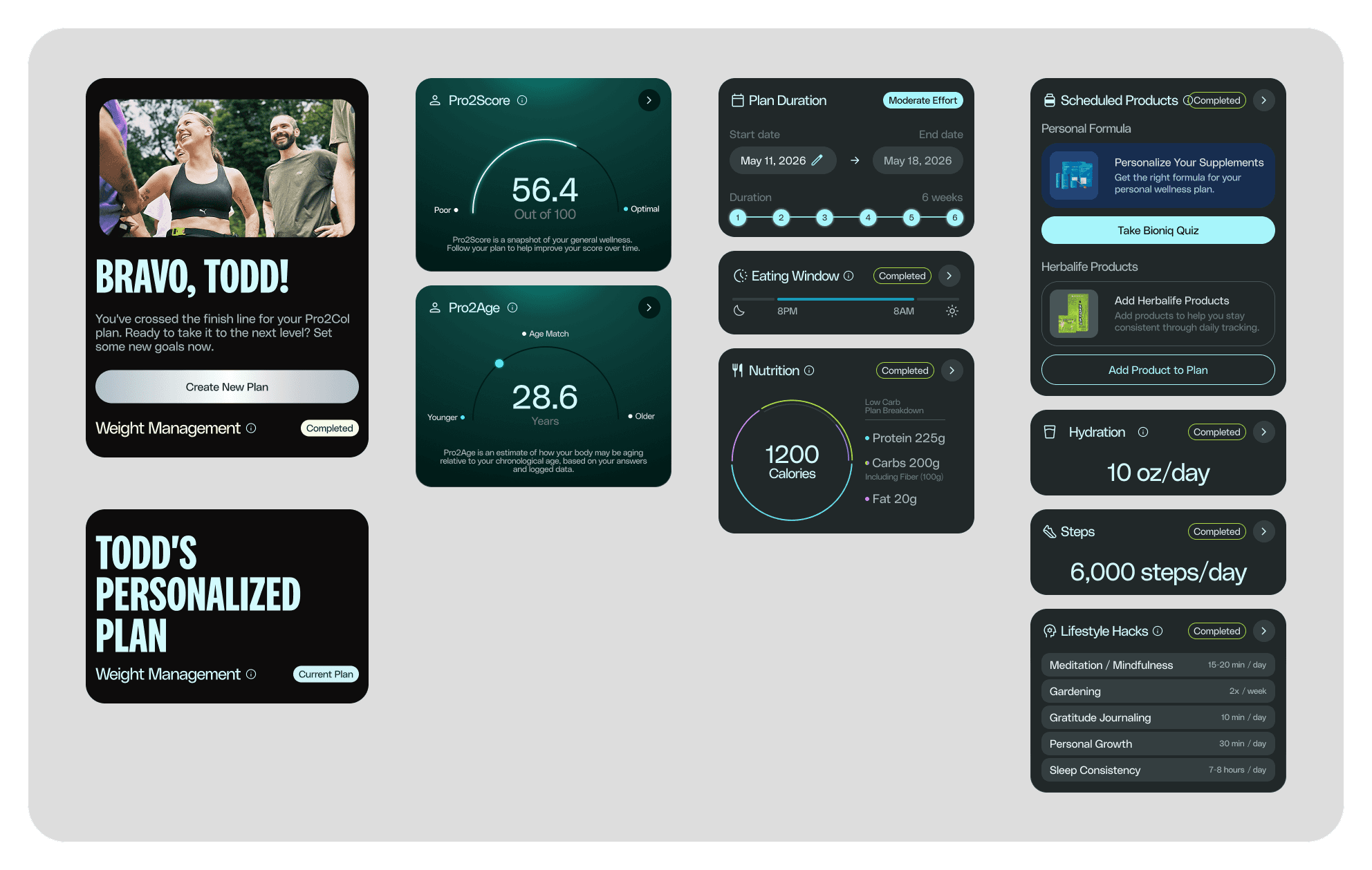
Plans translate wellness data into structured, actionable guidance — connecting scores, goals, duration, nutrition, and recommendations into a single narrative instead of isolated metrics. This gives the dashboard and insights work a clear destination to point users toward.
Forecasting was slow and error-prone due to siloed systems, lack of automation, and inconsistent data. Teams worked in isolation, manually updating Excel files, and constantly reconciling disconnected inputs. These inefficiencies didn’t just affect planning—they impacted operational reliability.
To ground our design strategy, we launched a comprehensive discovery phase: four weeks of field research, 62 interviews across 56 people, totaling over 45 hours of conversations. These sessions revealed widespread friction, from duplicated processes to missing version control and constant miscommunication between departments.
WELLNESS CATEGORIES
Modular, but connected
WELLNESS CATEGORIES
Modular, but connected
CONTEXT
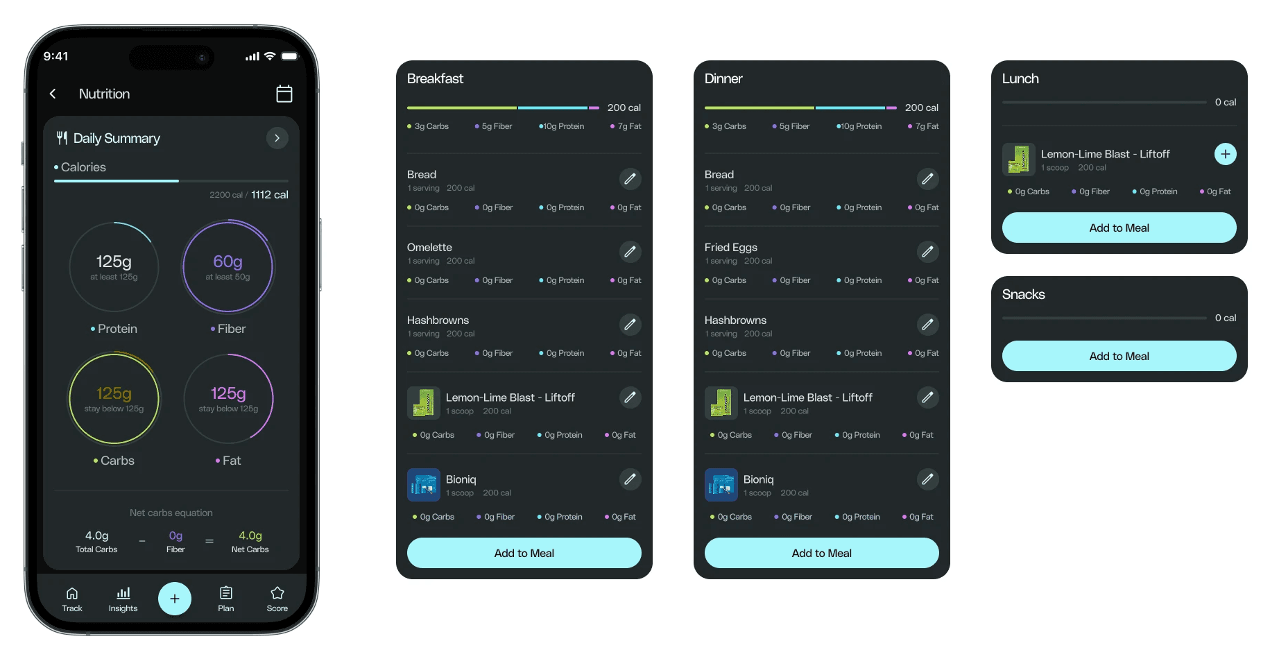
Nutrition, hydration, movement, eating windows, workouts, and lifestyle habits each carry distinct behaviors. Rather than isolated utilities, the categories are designed as modular surfaces that stay connected to the broader ecosystem — keeping the platform scalable as new areas are added.
User journeys helped us visualize how different personas moved through the platform. We focused on simplifying common workflows like reviewing a new forecast, testing a scenario, or aligning across departments before a cycle deadline.
This mapping revealed moments of unnecessary friction: manual handoffs, unclear ownership, and lack of validation points. We then designed features that aligned with each journey—prioritizing visibility, control, and collaboration.
Quick Actions
Quick Actions
Quick Actions
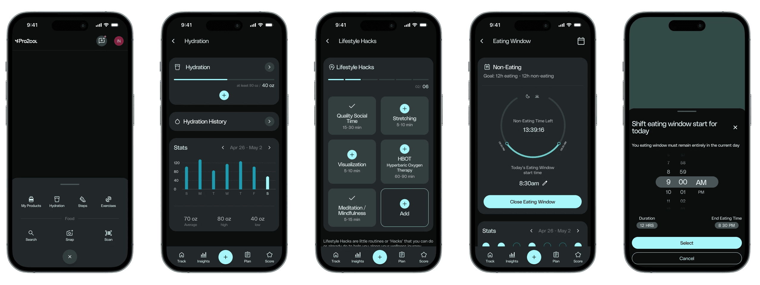
Daily logging is where wellness apps quietly lose people — if it takes effort, it doesn't happen. A centralized quick-actions flow keeps the highest-frequency tasks lightweight and always within reach, which also feeds the insights surface with enough data to stay useful.
The platform’s UI was modular and role-based. Each persona had a dedicated view with widgets tailored to their needs, such as forecast creation tools, status indicators, and performance dashboards.
One of the most powerful additions was the Forecast Sandbox—a space where users could simulate production scenarios by adjusting variables like cycle time, output volume, or failure rates. These simulations updated in real time and could be saved, shared, or annotated for later review.
BLOOD BIOMARKERS
Clinical data made approachable
BLOOD BIOMARKERS
Clinical data made approachable
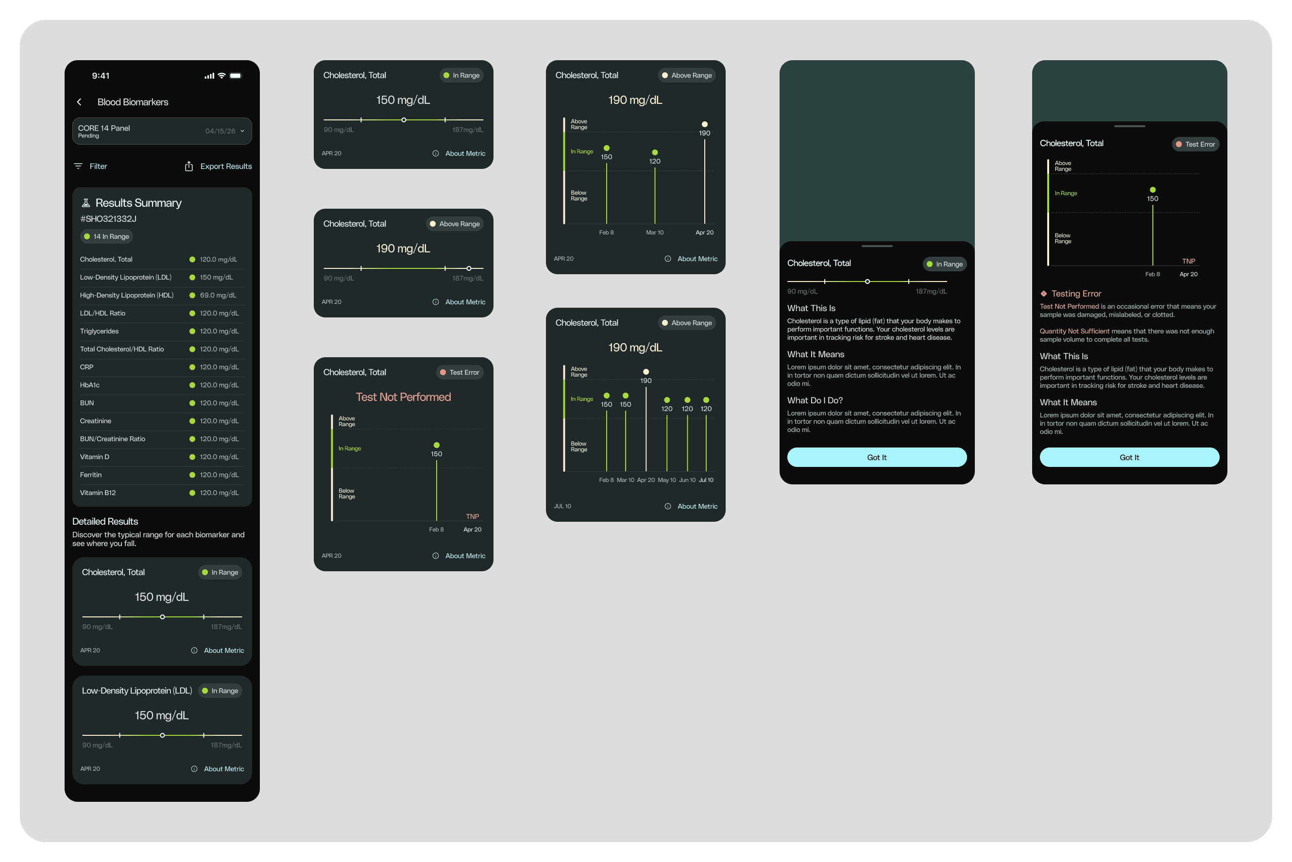
As the platform matured toward measurable outcomes, blood biomarker integration brought clinical data into a consumer experience. The challenge was keeping it approachable rather than intimidating — framing results as part of the wellness narrative, not isolated lab reports.
User journeys helped us visualize how different personas moved through the platform. We focused on simplifying common workflows like reviewing a new forecast, testing a scenario, or aligning across departments before a cycle deadline.
This mapping revealed moments of unnecessary friction: manual handoffs, unclear ownership, and lack of validation points. We then designed features that aligned with each journey—prioritizing visibility, control, and collaboration.
OUTCOME
Clarity, aimed at the hardest problem
OUTCOME
Clarity, aimed at the hardest problem
Pro2col moved toward a more focused, behavior-aware experience — organized around reducing cognitive load, making progress visible, and lowering the cost of daily engagement, all aimed at the platform's hardest problem: keeping people engaged past the first week.
The combined redesign of the Distributor Hub gave Herbalife’s users a more intuitive, focused, and empowering digital experience.
First-time distributors now receive clear guidance through a structured onboarding path, completing essential setup tasks with visual progress indicators. Returning users benefit from fast access to the tools that matter most, grouped logically and presented with clarity.
On the analytics side, users now have visibility into the health of their storefront—something that was previously absent. They can identify trends, track customer behavior, and evaluate the effectiveness of their promotions and product strategies.
Together, the new dashboard and performance experience form the foundation of a more scalable and human-centric distributor platform—supporting growth, efficiency, and long-term engagement.
REFLECTION
REFLECTION
The hard part of a product like this isn't adding capability — it's restraint. With biometric data, AI coaching, and tracking all available, the temptation is to surface everything. My job was the opposite: deciding what not to show, so the experience stayed clear enough to become a daily habit. In a product whose business case rests on long-term behavior change, that restraint is the strategy.
The combined redesign of the Distributor Hub gave Herbalife’s users a more intuitive, focused, and empowering digital experience.
First-time distributors now receive clear guidance through a structured onboarding path, completing essential setup tasks with visual progress indicators. Returning users benefit from fast access to the tools that matter most, grouped logically and presented with clarity.
On the analytics side, users now have visibility into the health of their storefront—something that was previously absent. They can identify trends, track customer behavior, and evaluate the effectiveness of their promotions and product strategies.
Together, the new dashboard and performance experience form the foundation of a more scalable and human-centric distributor platform—supporting growth, efficiency, and long-term engagement.